Comparing is the most powerful instructional strategy you can use in the classroom. But it's the person who does the comparing that's learning. Therefore, we must ask students to develop the comparison, not just learn and repeat the model that we present to them. (Remember, asking a student to fill out a Venn diagram that you created, is just a graphic form of information filing). After they have designed their comparison, students should also be asked to share what they learned. A major component of 21st century literacy is finding meaningful ways to share information with others.
Many Eyes is a great new website that gives teachers and students a chance to easily use sophisticated graphic tools to analyze data and create interactive displays. Those who register at the site can use 16 visualization types to present data. My favorite visualization is the "Wordle," which enables you to see how frequently words appear in uploaded text, or see the relationship between a column of words and a column of numbers. You can tweak your word "clouds" with different fonts, layouts, and color schemes. Why not have your students use Wordle to analyze a selection of non-fiction text to uncover the main ideas and key vocabulary of the piece? Or they could compare text from different sources. Want your students to more fully understand your course content? Let them use Many Eyes to visualize and discover patterns as a catalyst for discussion and collective insights about information, text, and data. As they say at Many Eyes, "Finding the right way view your data is as much an art as a science. The visualizations provided on Many Eyes range from the ordinary to the experimental."
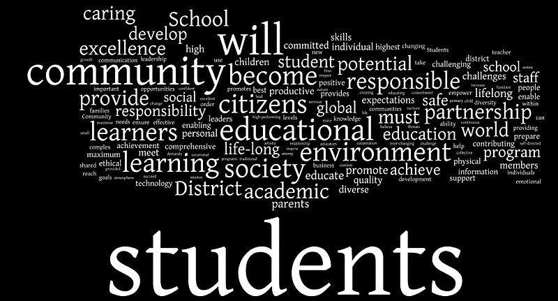
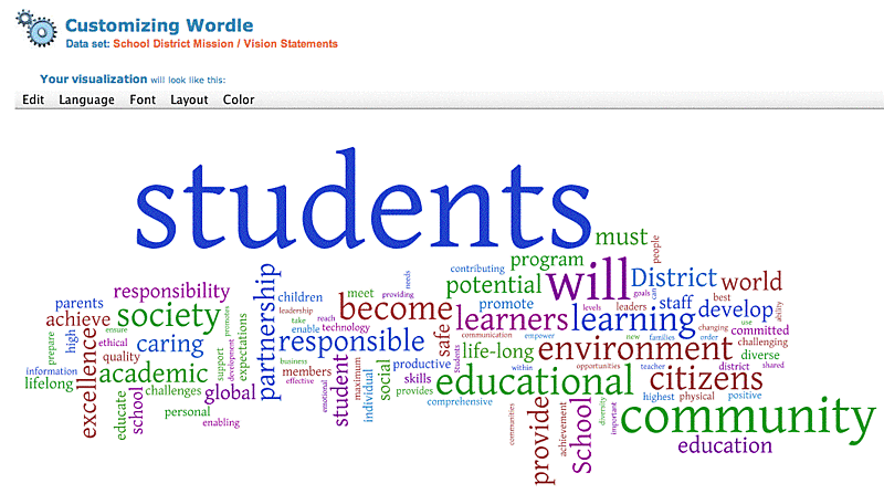
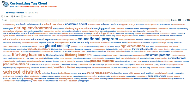
Here's a few examples of the same data in three different Wordle visualizations that analyze the frequency of words in 30 school district mission / vision statements.
The original data and was uploaded to Many Eyes by PPreuss and used to create the visualization above. I modified the existing online data set mission / vision statement words with the Wordle tools to represent the same data in different layouts and styles. In this second version (below) I limited the analysis to the top 100 words.
Here's a third representation of the same source data that analyzes 2-word clusters and displays their frequency in alphabetical layout. Below is a screen shot of the Tag Cloud, but in its original form at Many Eyes, when I click on any of the word clusters, a pop-up shows the context of how the cluster is used in different sentences from the source mission / vision statements.
Wow! Looks like we educators have a lot on our plates. Personally I think we might want to admit our mission / vision may simply be "Trying Hard Not To Become Obsolete."


