Looks like the Google gang have some extra time on their hands. They created collaborative spreadsheet art using Google docs. Sure fits my definition of Bloom's highest level of thinking – creating – a new combination of old elements. Click here for more info and a template.
Look into the Face of Student Engagement
It's easy for teachers to feel like their students are far too distracted by the many glowing screens that light up their lives. Robbie Cooper, a photographer and video artist, explores the impact of these information screens in his new "Immersion" project. It offers a fascinating look directly into the faces of British and American kids playing video games (with varying levels of violence) – including Halo 3, Call of Duty, GTA 4, Tekken and Star Wars Battlefront. Cooper uses a system that stations a high resolution video camera right behind the projected game screen.

It's painful to look into the faces of students so caught up in the (sometimes) violent world of video games. I wonder if the students are attracted to the violence or the fact that video games create environments that provide them with an engaging mix of interaction, feedback, and information control? View more project still images here.
He has edited some of his material into this short video.
Share this:
Sequencing – An Essential Summarizing Skill
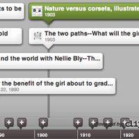

I’ve been experimenting with Dipity, a new website that allows you to build interactive timelines. Open a free account, create a new topic, and then upload text and images (from a file.) You can view your topic as an timeline or flipbook. You can even geocode your events and view the project as a map. You are allowed to set permissions for viewers and editing rights. I created a sample timeline “How did the roles and rights of women change at the turn of the 20th century?” Note: One drawback for classroom use – banner ads appear on the page and I can’t vouch for what might show up.
Dipity allows you to configure the display of the topic and copy and paste the embed code into your page. You should be able to click the embedded image below.
Share this:

Visualizing Data and Text – A Comparison Learning Strategy that Works
Comparing is the most powerful instructional strategy you can use in the classroom. But it's the person who does the comparing that's learning. Therefore, we must ask students to develop the comparison, not just learn and repeat the model that we present to them. (Remember, asking a student to fill out a Venn diagram that you created, is just a graphic form of information filing). After they have designed their comparison, students should also be asked to share what they learned. A major component of 21st century literacy is finding meaningful ways to share information with others.
Many Eyes is a great new website that gives teachers and students a chance to easily use sophisticated graphic tools to analyze data and create interactive displays. Those who register at the site can use 16 visualization types to present data. My favorite visualization is the "Wordle," which enables you to see how frequently words appear in uploaded text, or see the relationship between a column of words and a column of numbers. You can tweak your word "clouds" with different fonts, layouts, and color schemes. Why not have your students use Wordle to analyze a selection of non-fiction text to uncover the main ideas and key vocabulary of the piece? Or they could compare text from different sources. Want your students to more fully understand your course content? Let them use Many Eyes to visualize and discover patterns as a catalyst for discussion and collective insights about information, text, and data. As they say at Many Eyes, "Finding the right way view your data is as much an art as a science. The visualizations provided on Many Eyes range from the ordinary to the experimental."
Here's a few examples of the same data in three different Wordle visualizations that analyze the frequency of words in 30 school district mission / vision statements.
Click on images to enlarge.

The original data and was uploaded to Many Eyes by PPreuss and used to create the visualization above. I modified the existing online data set mission / vision statement words with the Wordle tools to represent the same data in different layouts and styles. In this second version (below) I limited the analysis to the top 100 words.

Here's a third representation of the same source data that analyzes 2-word clusters and displays their frequency in alphabetical layout. Below is a screen shot of the Tag Cloud, but in its original form at Many Eyes, when I click on any of the word clusters, a pop-up shows the context of how the cluster is used in different sentences from the source mission / vision statements.
Wow! Looks like we educators have a lot on our plates. Personally I think we might want to admit our mission / vision may simply be "Trying Hard Not To Become Obsolete."

Share this:
Summarizing What’s Important with a “How To” Video
Explaining “how to” requires students to research a subject, evaluate what’s important, and create a guide for someone else to follow. It gives them an opportunity to write for an authentic audience and purpose and use skills that rank very high on Bloom’s taxonomy. When we ask students to summarize without giving them an audience and purpose all we are doing is asking them to “guess what the teacher thinks is important.”
A few weeks ago I posted on the great opportunities for students to teach others by creating how to videos. Since then I ‘ve found a great source list of How To video sites at ReadWriteWeb.