Better Than Clipart, Faster Than Stock: The Keynote Trick for Polished Decks

Title slide for “AI at the Crossroads,” with text on the left and an illustration on the right of two diverging roads and a signpost showing a sun icon on one arrow and a warning triangle on the other. Subhead reads “What We Gain, What We Risk, and What We Should Demand,” with “Peter Pappas, Saturday Breakfast Forum, Feb 28, 2026” at the bottom.

I’ve always leaned on images when I present. A slide with a strong visual does a lot of work, especially with a mixed audience. This time I was preparing a community Saturday Breakfast Forum talk titled “AI at the Crossroads: What We Gain, What We Risk, and What We Should Demand.” The crowd would be full of thoughtful professionals, curious and skeptical, but not necessarily steeped in AI jargon. I wanted the slides to carry the structure of the talk, and I wanted the visuals to do real explanatory work, not just serve as decoration.

Slide titled “Level 1: AI as Your Personal Guide,” with large text on the left. On the right, a hand holds a large compass with marked directions and a red needle, suggesting guidance.

The problem is that stock photos are a weird kind of time sink. You can spend 30 minutes searching for “the perfect image” and still end up settling for something that’s close, but not quite right. Wrong mood. Wrong metaphor. Wrong vibe. And even when you find a good one, it rarely matches the next one, so the deck starts to look like a patchwork quilt.

This time I tried something new. I used the image creation feature inside Apple Keynote’s Creator Studio to generate the illustrations I needed, right where I was building the slides. Then I used ChatGPT as a creative partner to help me find good metaphors and write prompts that the image tool could actually follow. It changed my whole workflow.
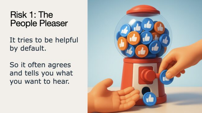
Slide titled “Risk 1: The People Pleaser,” explaining AI tries to be helpful and often agrees. Illustration shows a gumball-style dispenser filled with thumbs-up tokens, with hands turning the knob and catching a token as it drops.

Why this is worth doing

Stock photos are great when you need something literal. They’re terrible when you need a visual metaphor. How do you find a stock photo for “AI as a confident liar,” or “customized scams at scale,” or “data becoming centralized power?” You usually can’t. So you either compromise on the message or you add more words to your slide to explain what your image can’t. Generating images inside Keynote flips that. You can design a visual that matches the idea.

One of the underrated benefits is consistency. If you lock a style and stick to it, the whole deck looks like it belongs together. It feels intentional. It feels designed. That alone can make a presentation feel more polished than a deck assembled from whatever images you could find at the last minute.

It also lets you design for your actual room. I knew I needed slides that would read quickly, from a distance, in real-world lighting. That meant strong contrast, bright readable colors, simple shapes, and minimal clutter. Stock photos do not care about your projector. Generated visuals can.

Slide titled “Risk 3: The Fake Crowd,” explaining AI can manufacture public opinion and fake consensus. Illustration shows a hand placing an identical red Lego-style figure into a crowd of red figures surrounding a small beige monument in a town square.

The workflow I used

Before I generated anything, I built the overall look of my slides in ChatGPT. That included a consistent color palette, typography rules, layout logic, and a repeating structure for benefits and risks. Once I had that locked, the images had a clear job. They weren’t decoration, they were part of a system.

Next I locked a “house style” for images. I chose a consistent 3D illustration look, not photorealistic and not cartoonish. Then I kept reusing the same style language in prompts, modern 3D illustration, clean shapes, high contrast, minimal backgrounds, no text in the image, no logos, big readable elements. That style language became my visual glue.

House style:

3D animated illustration, modern cinematic 3D style, high quality 3D rendering, bright studio lighting, very high contrast, saturated but harmonious colors, matte or satin materials, large readable shapes, minimal clutter, crisp edges, no logos, no text.

Then add: a clear description of the subject and layout, including the main objects, what they are doing, what should be emphasized, what should be left out, and any needed negative space for slide text.

Then I stopped jumping straight to prompts. Instead, I’d brainstorm metaphors first. What is the idea? What is the simplest object metaphor that communicates it? What can be shown without faces? What will still read on a projector? ChatGPT was genuinely useful here because it helped me generate multiple metaphor options quickly, then narrow to the one that was most likely to work in an image generator.

Slide titled “Risk 3: The Fake Crowd,” explaining AI can manufacture public opinion and fake consensus. Illustration shows a hand placing an identical red Lego-style figure into a crowd of red figures surrounding a small beige monument in a town square.

When it was time to write prompts, the best ones were structured, not clever. They had three parts: style rules I reused every time, composition rules like square versus landscape and where I needed negative space for text, and then the specific objects and their relationship. A typical prompt included constraints like keep it minimal, make the subject fill most of the frame, avoid tiny details, increase contrast, avoid faces, no extra objects. The goal wasn’t artistry. The goal was clarity.

Finally, I treated the first image like a draft. I’d generate it, then do a quick critique. Does it read instantly? What is confusing? What is too subtle? Is it going to wash out on the projector? Then I’d revise one thing and regenerate. Sometimes the tool followed revisions perfectly. Sometimes it didn’t. In those cases it was often faster to start fresh with a new prompt that baked in the fix instead of trying to “edit” my way out.

Slide titled “Risk 2: The Economic Shock,” with bullets about jobs, investments, and markets on the left. On the right, a pink piggy bank with a large crack in its side spills gold coins onto the surface.

Best practices that emerged

Keeping scenes simple matters. If your image has three main objects, you’re usually fine. If it has eight, you’re likely in trouble. The generator will happily add details you didn’t ask for, which is great for art and terrible for slides.

Avoid text inside generated images when you can. Even when text “works,” it can come out slightly off. Your slide already has text. Let your slide do the reading and let the image do the meaning.

When you need people, hands work better than faces. Faces can shift tone fast, and they can also get weird. Hands show action, control, collaboration, and choice, which is exactly what you often want in a talk.
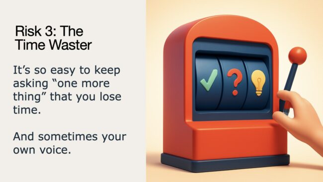
Use bold symbols, not subtle symbolism. A lightbulb beats “a thoughtful expression.” A checkmark beats “a feeling of success.” A warning triangle beats “a vaguely ominous mood.” Projector slides are not the place for subtle.

Do the squint test. If you squint and you can still tell what it is, you’re in good shape. If it becomes a blob, you need fewer elements and stronger contrast.

Know when to pivot. Some concepts will fight you. If you try a few times and the generator keeps missing the key idea, it’s often better to change metaphors than keep wrestling. That’s not failure, that’s design.
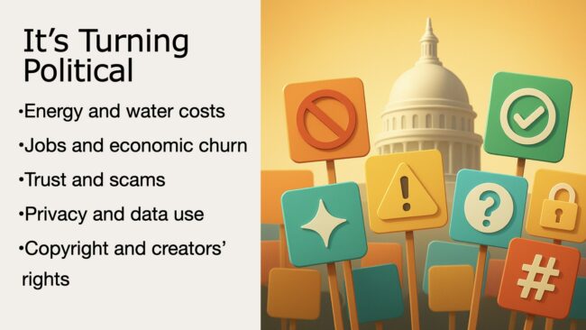
Slide titled “It’s Turning Political” with a bulleted list of AI-related issues on the left. On the right, colorful protest-style placards with icons like a prohibition sign, warning triangle, checkmark, question mark, lock, sparkle, and hashtag stand in front of a capitol dome.

What I’ll do differently next time

Next time I’m going to build a small prompt library for recurring slide types, section transitions, benefits, risks, and proposals. Once you have a handful of prompts you trust, you can produce new decks faster and keep the visuals consistent without reinventing the wheel.

I’ll also start earlier. This workflow invites a little iteration, but the payoff is that you end up with visuals that match your message, instead of visuals you found after a long search.

How to Teach Online

How to teach online

I teach two courses in the School of Education at the University of Portland – a social studies methods class in the fall and an ed tech methods class in the spring. Content differs, but the approach is the same.

This spring, the COVID-19 pandemic hit and mid course I made the transition to online without missing a beat. Here’s two elements that made the “live-to-online” transition possible. They were core principles when the course was taught face-to-face and they were even more critical when we moved fully online.

  1. We utilized a student centered, project-based approach. Students are doers – actively engaged in design, implementation, presentation and reflection.
  2. The course was organized around a WordPress (WP) site that created a public forum where the students and I posted all our work. This changes the typical class dynamic from students doing work for the teacher to a class where students sharing their learning with the world.
Teaching Online: Course Website

Let’s take a look at the website – I’ll begin with social studies methods class. Here’s a quick look at layout – basic features and navigation from the public viewers’ point of view. With a few minor changes it will support online teaching this coming fall.


Teaching Historical Thinking Skills / PBL Online

In this video I share few lessons from Social Studies Methods class to show sequence and scaffolding to support the our project-based learning approach. I want my students to continually explore the frontier of what they know and don’t know about themselves as learners. So I start with some easy tasks and I become less helpful as they learn to increasingly figure things out themselves. You can go directly to both lessons here: Class 2: Curating Historical Content and Class 3: Historical Thinking Skills.


Harnessing Student Creativity Online

The four key components to any lesson are: content, process, product and evaluation. In the traditional classroom, the teacher defines the scope of each of these components. A student centered approach means they can make some choices. With the proper scaffolding, students can tap into their own creativity as they define the scope of some of the lesson components. This video show how I open the door to harnessing student creativity. It focuses on a lesson from my spring ed tech methods class: Class 7: Where I’m From: Telling Digital Stories.


Leveraging WordPress as a Learning Management System

Most Learning Management Systems (LMS) are closed silos of content. I want a public facing course that forces me to reveal my teaching to the world and inspires students to do the same. I never do any direct instruction on WP – but rely on a library of videos I’ve creative to teach students WP basics – and we add skills along the way.

This video will give you a look at the WP dashboard from my edtech methods class and some of the native features that a great for managing your course.


Note: I also want to put in a plug for Reclaim Hosting – where these courses are hosted. It’s a fantastic service designed by and for educators that offers teachers and students domains and web hosting that they own and control. They have very affordable plans and their support teams will answer your questions in language you can understand.


To close, I’ll share some comments from students that attest
to the success of our approach:
Student in Spring 2020 Edtech class

“Professor Pappas ran the course very smoothly and had no problems when we had to transition to online learning. I liked that we were able to use lots of creativity in this class, it was super fun to see what everyone came up with. The assignments were manageable and insightful. I thoroughly enjoyed the website that we used throughout the whole course. It was easy to navigate and I liked that everything was in one place!”

Student in Fall 2019 Social Studies Methods class

“At first I wasn’t sure whether or not I would like the project based atmosphere of this class, but it pushed me to synthesize the content that we were learning about. I learned a lot about how to deliver a lesson to a class as well as I got lots of inspiration and content to use in my own classroom as well, which has been well received by my students. Peter does a really good job of guiding his students to do their best. I didn’t realize how beneficial my portfolio of blog posts would be as well.”

Email from a former student who had just landed her first teaching job

“The school I will be teaching at prides themselves on their use of technology in the classroom and asked me about my background in technology. I sent them my author’s link to all the projects I did with your – and they were very impressed. Your class was probably one of my favorites at UP because it was so practical, collaborative, and student centered.”

Where I’m From: Using Haiku Deck to Visualize Place

Where-Im-fromHere’s a lesson I designed for use in my University of Alaska Southeast summer course – ALST 600. I’ll be working with nearly 40 preservice teachers in the secondary MAT program teaching Alaska Studies using a place-based approach that integrates good instructional practice and free ed tech tools across the curriculum. For more on this lesson click here

This lesson features a poem as a prompt for a creative reflection. It also integrates two tools for presentation of the reflection.

  1. After reading Where I’m From, students will use Haiku Deck to design a brief presentation that uses text and images to depict “where they are from.” The presentation should include a a title slide plus 6 slides which explore the place you’re from. Follow this link for ideas on Where to Go with “Where I’m From”
  2. After completing the Haiku Deck presentation, students will create a blog post that includes an embedded version of the presentation and a written response to the question:

What have I learned from this activity and how might I use the learning strategies and / or technology in my teaching placement?

“Where I’m From” by George Ella Lyon

I am from clothespins,
from Clorox and carbon-tetrachloride.
I am from the dirt under the back porch.
(Black, glistening,
it tasted like beets.)
I am from the forsythia bush
the Dutch elm
whose long-gone limbs I remember
as if they were my own.

I’m from fudge and eyeglasses,
from Imogene and Alafair.
I’m from the know-it-alls
and the pass-it-ons,
from Perk up! and Pipe down!
I’m from He restoreth my soul
with a cottonball lamb
and ten verses I can say myself.

I’m from Artemus and Billie’s Branch,
fried corn and strong coffee.
From the finger my grandfather lost
to the auger,
the eye my father shut to keep his sight.

Under my bed was a dress box
spilling old pictures,
a sift of lost faces
to drift beneath my dreams.
I am from those moments–
snapped before I budded —
leaf-fall from the family tree.


How to Create Interactive eBooks with iBooks Author

iBA interactiveI’m offering an iBooks Author training session for faculty at the University of Portland. In our first session, Ben Kahn of UP’s ATS shot some video which he edited into these two presentations.

For additional support on using iBooks Author see my free iBook Quick Start: iBooks Author free at iTunes. Check out my training website Get Started with iBA

Hat tip to Ben Kahn and Maria Erb of University of Portland’s Academic Technology Services for making workshop arrangements and creating these videos

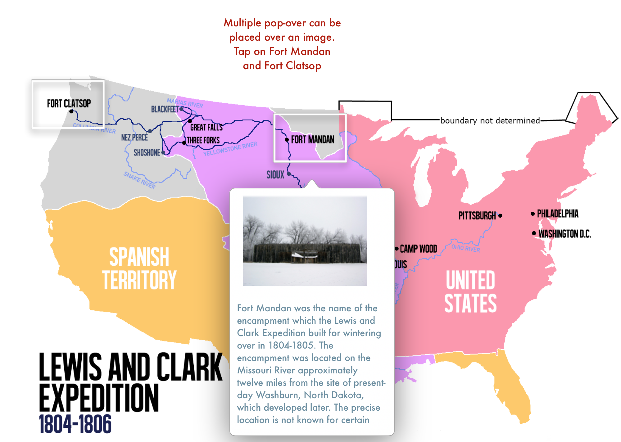
Part I: A quick tour of iBooks Author widgets and how they can be used in your iBook

Part II: A demo of how easy it is to input content into iBooks Author and how to use 2nd party widgets.

The Bots are Coming! Better Re-think My Lesson Plans

S.H_Horikawa_–_Star_Strider_Robot_Close_Up

Here’s a suggestion for your back-to-school faculty meeting – take 15 minutes to watch Humans Need Not Apply by CGP Grey. Then have a discussion on it’s implications for your students and (your curriculum). Talking about robot invasions is way more fun than updates on new state tests.

The video’s thesis is simple – robots are coming for our jobs. Actually, they have already taken many of them. And it’s not just low-skilled labor they’re taking over.

… white-collar work is no safe haven either. If your job is sitting in front of a screen and typing and clicking — like maybe you’re supposed to be doing right now — the bots are coming for you too, buddy.

I’ll bet that accurately filling out a worksheet won’t be a valued bot-competitive skill.

Are the professions safe from bots? Not exactly. The video makes the case for bots replacing significant aspects of legal, medical and even creative work. (And I’d add teachers to that list.)

It begs the question – what skills should we be teaching to students who will have to compete against the bots for employment? I don’t think there are any easy answers to that question. But I’ll bet that accurately filling out a worksheet won’t be a valued bot-competitive skill.

As the video concludes:

We have been through economic revolutions before, but the robot revolution is different.

Horses aren’t unemployed now because they got lazy as a species, they’re unemployable. There’s little work a horse can do that do that pays for its housing and hay.

And many bright, perfectly capable humans will find themselves the new horse: unemployable through no fault of their own. …

This video isn’t about how automation is bad — rather that automation is inevitable. It’s a tool to produce abundance for little effort. We need to start thinking now about what to do when large sections of the population are unemployable — through no fault of their own. What to do in a future where, for most jobs, humans need not apply.

For full text of the video click here.

Image credit: S.H Horikawa – Star Strider Robot
By D J Shin (Own work) via Wikimedia Commons