New Deal Poster DBQ: Public Persuasion or Propaganda

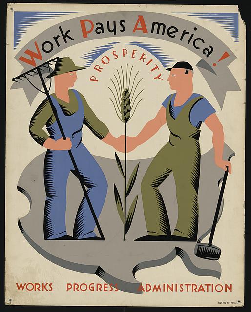
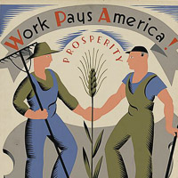
Work pays America Prosperityjpg

My Social Studies Methods class at the University of Portland recently published a free multi-touch iBook – Exploring History: Vol II. It features ten engaging questions and historic documents that empower students to be the historian in the classroom. For more info on our project and free download of multi-touch iBook version click here.

To better publicize student work, I’m featuring each chapter in it’s own blog post. More in series here.

Essential Question: How did the WPA use art to influence public opinion?

The New Deal and the Art of Public Persuasion
by Kari VanKommer Download as pdf (6.6MB)

The Federal Arts Program or the FAP was one arm of the WPA solely dedicated to the creation and promotion of the arts in America. One of it’s major undertakings were the creation of promotional posters, today known as the WPA Poster Collection. Between the years 1935 and 1943, the WAP and FAB collectively created and printed more than 2 million posters on more than 35,000 unique subject matters.

There are several key techniques academics used when analyzing materials that is created to persuade and in this DBQ these techniques will be helpful to use as well. The most import questions to ask yourself when looking at all of the posters in this collection are below.

  1. What is the ideology and purpose of the propaganda?
  2. What is the context in which the propaganda occurs?
  3. Who is the propagandist?
  4. What is the structure of the propaganda organization?
  5. Who is the target audience?
  6. What techniques for persuasion are being used?
  7. What audience reactions are the techniques hoping to elicit?

Reflection by Kari VanKommer Twitter/@MissKVK

This project was such a great opportunity to try my hand at creating the type of relevant history lesson that I want to include in my curriculum as a future social studies teacher. Unfortunately, I did not fully take advantage of it as I wish I had. Initially I struggled narrowing down a subject, I wanted to land on something I felt a strong personal connection to which would also be relatively simple to construct a DBQ project around. Quickly settling on the topic of communism and the Red Scare, I felt confident, perhaps a little too confident. When I realized that someone had focused on that topic last year for this project, I decided that topic would no longer work for me. I could have carried on with the communist angle and perhaps focused more specifically on one aspect of it such as the Rosenbergs or the Cuban Missile Crisis, but my internal drive to be as close to original as possible forbid me from this. Instead I decided to switch gears entirely.

After debating various topics in my head from Civil War Reconstruction to the often forgotten historical figure of Noah Webster, of that dictionary we refer to from time to time (who I discovered in my preliminary research may have been a thoroughly unlikable fellow which is why his contributions to the founding of the USA have largely been forgotten…) but I digress. After bouncing around a variety of ideas after the Red Scare topic fell through, I finally settled on focusing my DBQ on the New Deal and the various forms of propaganda and art that came out of that time period in American life.

This period in history is complicated and filled with difficulties and political initiatives that mirror our own times to such a degree it is almost unsettling. Much as President Obama has needed to sell his ideas for recovery and change in the last six years such as the Affordable Care Act, so FDR needed to sell his plan for getting America out of the Great Depression. The poster collection created by the WPA and FAP between 1933-1943 is one of the first things I re-discovered when researching this topic. They are beautiful, modern and striking. The have an agenda, often times more than one and they have much to tell us about what art can do to shift public opinion, and what those responsible for creating those posters believed needed to be shifting.

Once I settled on a topic my drudgery through this project was not alleviated. I did not have a focused point of view or purpose for the posters though I know I wanted to use them. Peter Pappas helped me collate my thoughts on what things could be asked of students in relation to the artwork and what conclusions or inferences could be drawn that might be helpful. My resulting DBQ project is not the best thing I have every produced, but it is definitely a place to start. As one of my favorite authors Elizabeth Gilbert has said “You must be very polite with yourself when you are leaning something new.”

If I could do it again I would get started much sooner, put my head down and find a topic I felt was original and interesting. I might have focused on maps or the layout of cities in America or something closely related to that. The good news is I hope to be at this for a while and I think the benefit of DBQ questions can not be understated, so I might just get me do-over shot after all. For now it’s about doing the best you can and learning that procrastination does not a stellar project make.

Image credit: Work pays America! Prosperity.
Library of Congress: LC-DIG-ds-04632
How to Read Documentary Films

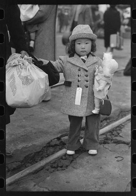
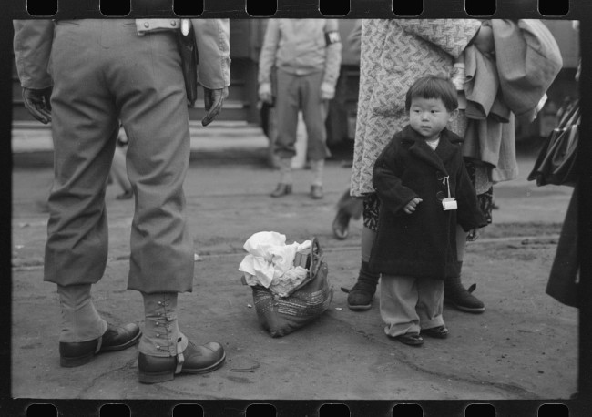
Child waiting to be taken to Manzanar April 1942 LC-DIG-fsa-8a31173

While many are aware that the US government forcibly removed and incarcerated more than 120,000 U.S. residents of Japanese ancestry during WWII. Few people know that the government recruited some of these same people to work at farm labor camps across the west to harvest crops essential to the war effort.

Uprooted from Uprooted Exhibit

Uprooted: Japanese American Farm Labor Camps During World War II is a traveling photography exhibit (and website) that tells this story and provides a treasure trove of resources for historians, teachers and students. Uprooted draws from images of Japanese American farm labor camps taken by Russell Lee in the summer of 1942. Lee worked as a staff photographer for the Farm Security Administration (FSA), a federal agency that between 1935 and 1944 produced approximately 175,000 black-and-white film negatives and 1,600 color photographs.

I worked with the Uprooted team and developed a lesson How reliable are documentary films as a historic source? (Lesson Plan 2) The lesson begins with the teacher telling students that they are about to watch two short videos about the experience of some Japanese Americans during World War II.

The first video was made in 2014 by documentary filmmakers to accompany the Uprooted Exhibit. It features historic video from World War II as well as oral history interviews with Japanese Americans that the filmmakers shot in 2013 and 2014. The narration is taken from the interviews.

The second video was made in 1943 by the US government as an informational service to the US public. It features video shot in 1941 and 1942 and narration by a government official.  Before the videos are shown, the teacher asks the students which video they think will be a more reliable historical source. (Be sure to have them justify their thinking to their peers). Prompts include:

  • A video made in the era being studied or a video made over seventy years later?
  • A video made by the United States government or a video made by documentary filmmakers?
  • A video narrative by a government official or a video narrated by people who participated in the event?

The lesson then guides students through comparisons of both videos based on close reading strategies – what does the video say? how does it say it? what does it mean to me?

A complete lesson plan, collection of images and historic documents is available at Uprooted. A second lesson plan considers the question:  How reliable are documentary photographs as a historic source? (1.1, 1.2, 1.3) The site even includes a kit for students to curate their own Uprooted museum mini-exhibit.

You can find Uprooted on Twitter | Facebook | Flickr | Instagram

The museum exhibit open at The Four Rivers Cultural Center in Ontario, OR on September 12, 2014 and runs through December 12, 2014. It then travels to Minidoka County (ID) Historical Society and the Oregon Nikkei Legacy Center in Portland Ore. More exhibit info and updates

I’d like to close this post by crediting the talented team behind Uprooted. Curator – Morgen Young, Web and Graphics Designer –Melissa Delzio, Videographers – Courtney Hermann and Kerribeth Elliott. Uprooted is a project of the Oregon Cultural Heritage Commission.

Image credit:  Child waiting to be taken to Manzanar, April 1942, Los Angeles, California. Photographer Russell Lee. Library of Congress (Prints & Photographs Division, FSA-OWI Collection, LC-USF33-013290-M4)

How to Read Documentary Photographs

Russell Lee Los Angeles 1942. LC-USF33-013296-M4

While many are aware that the US government forcibly removed and incarcerated more than 120,000 U.S. residents of Japanese ancestry during WWII. Few people know that the government recruited some of these same people to work at farm labor camps across the west to harvest crops essential to the war effort.

Uprooted: Japanese American Farm Labor Camps During World War II is a traveling photography exhibit (and website) that tells this story and provides a treasure trove of resources for historians, teachers and students. Uprooted draws from images of Japanese American farm labor camps taken by Russell Lee in the summer of 1942. Lee worked as a staff photographer for the Farm Security Administration (FSA), a federal agency that between 1935 and 1944 produced approximately 175,000 black-and-white film negatives and 1,600 color photographs.

Many are familiar with the work of Lee’s colleague Dorothea Lange, who worked for the War Relocation Authority in 1942. Lee also made significant contributions to the photographic record of the Nikkei wartime experience. Between April and August of 1942, he took some six hundred images of Japanese Americans in California, Oregon, and Idaho, including rare documentation of farm labor camps. To explore all of Lee’s FSA photographs, visit the Library of Congress website.

Farm Labor ad from the Minidoka Irrigator (camp newspaper)

Uprooted also features video interviews with Japanese Americans who lived and worked in these seasonal farm labor camps as well as an archive of engaging historic documents from the era. Lee’s photographs depict smiling Japanese Americans cheerfully making the best of  farm work and living in tents. But the interviews and historic documents tell a different story – harsh fieldwork, substandard living conditions and local townspeople suspicious of these intruders and their “questionable loyalty.” Even the incarcerated Japanese Americans were divided about working in the farm labor camps. Some saw it as an better alternative than the barbed wire of camps like Manzanar or Minidoka. But others resisted after hearing stories of grueling “stoop” labor, primitive housing and hostile locals.  

While Uprooted focuses on a what some might consider a “footnote” of the US WWII homefront experience, I recognized that this rich collection could provide students with the material to develop historical thinking skills in sourcing, contextualizing, corroborating and close reading.

How does this collection of video interviews and historic documents help shed light on Lee’s intent? Was he trying to gloss over the harsh living and working conditions to help recruit more farm laborers? Was he trying to depict the noble and patriotic sacrifice of Japanese Americans forcibly stripped of their homes and livelihoods following the attack on Pearl Harbor by Japanese warplanes? Or did Lee simply shoot what he saw while on a photo assignment for the FSA? 

I worked with the Uprooted team and developed a lesson How reliable are documentary photographs as a historic source? (1.1 Teachers Guide, 1.2 Photographs, 1.3 Documents) Students begin by reflecting on the photographs they take and often share on social media. What do you see in the photographs? What stories do they tell? Next they are taken through scaffolded activities to closely examine Lee’s photographs and compare them to the often conflicting depictions of the farm labor camps found in the other historic documents. Finally they are asked to reconsider their contemporary social media photographs and how they might be interpreted by future historian studying “the life of a teenager in 2010s.” A complete lesson plan, collection of images and historic documents is available at Uprooted. The site even includes a kit for students to curate their own Uprooted museum mini-exhibit. A second lesson plan is also available. How reliable are documentary films as a historic source? Lesson plan 2. 

You can find Uprooted on Twitter | Facebook | Flickr | Instagram

The museum exhibit open at The Four Rivers Cultural Center in Ontario, OR on September 12, 2014 and runs through December 12, 2014. It then travels to Minidoka County (ID) Historical Society and the Oregon Nikkei Legacy Center in Portland Ore. More exhibit info and updates

I’d like to close this post by crediting the talented team behind Uprooted. Curator – Morgen Young, Web and Graphics Designer – Melissa Delzio, Videographers - Courtney Hermann and Kerribeth Elliott. Uprooted is a project of the Oregon Cultural Heritage Commission

Top Image credit: Library of Congress
Title: Los Angeles, California. The evacuation of Japanese-Americans from West Coast areas under U.S. Army war emergency order. Japanese-American family waiting for train to take them to Owens Valley
Creator(s): Lee, Russell, 1903-1986, photographer
Date Created/Published: 1942 Apr.
Medium: 1 negative : nitrate ; 35 mm.
Reproduction Number: LC-USF33-013296-M4

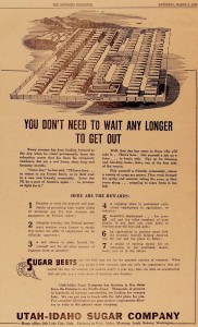
Newspaper Ad “You don’t need to wait any longer to get out.” From the Minidoka Irrigator.
Sugar companies posted recruitment notices and advertisements in public spaces throughout the camps, as well as in camp newspapers. Such advertisements emphasized seasonal labor as an opportunity to leave confines of camp, but also marketed the work as the patriotic duty of Japanese Americans, ignoring that they had been incarcerated and denied their civil liberties.
National Archives and Records Administration, Washington D.C., Record Group 210, War Relocation Authority.

Free iBook Explores Ancient Egypt

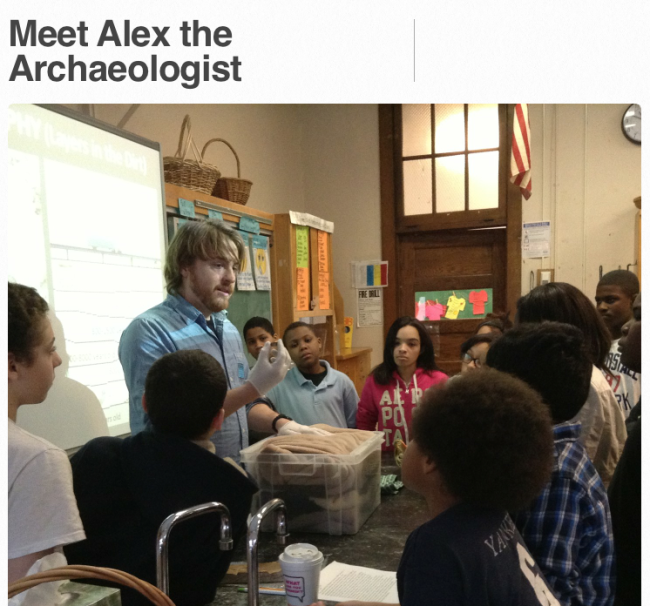
Meet Alex the Archaeologist

The Memorial Art Gallery Rochester NY recently published Ancient Egypt: Exploring Ancient Artifacts with Alex the Archaeologist. It’s available free from the iTunes Store.
Full disclosure: I’ve assisted MAG on a number of projects and was a “mentor” on this iBook

Ancient Egypt is interactive resource for teachers and students featuring video host – “Alex the Archeologist.” (Played by Alexander Smith, a Mediterranean archaeologist and graduate student at Brown University’s Joukowsky Institute for Archaeology and the Ancient World.)

Chapters include: Government and Wealth, Power and Protection, Gods and Goddesses, Journey to the Afterlife and a very interactive guide to reading hieroglyphics. “Stop and think” questions throughout the book foster student reflection. An illustrated glossary helps foster defining skills. Students can zoom in to closely examine artifacts and try their hand at interpreting hieroglyphics.

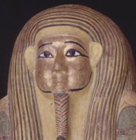
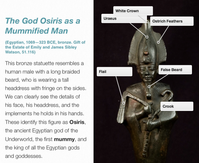
God Osiris

Designed for classroom use by grades 6–12, Ancient Egypt is the first in a series for young people studying the ancient world. Using the Gallery’s collection of artifacts, this thematic object-centered exploration uses works of art, timelines, video clips, photographs, and interactive media to take students into the world of earlier civilizations. It meets Common Core Standards as students learn to read objects as primary source texts.

The Memorial Art Gallery has many other great resources available online. A good place to start is at Passport to the Past. It features collections of image sets sized for use on Smartboards or in PowerPoints

5 Rules of Infographic Excellence

txkcd_infographic

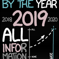
xkcd’s brilliant mockery of the explosion of “info-junk” (at left) should remind us that the best infographics should efficiently combine quantitative data, prompt pattern recognition and cogent visual storytelling.

Perhaps aspiring infographic designers would do well to revisit the work of the Edward Tufte, the guru of the art form. I’ve had a chance to attend one of his inspiring workshops, but you easily appreciate his thinking from his books. In his classic “The Visual Display of Quantitative Information,” he lays out his principles of Graphical Excellence (p 51) Graphical excellence is:

  1. well-designed presentation of interaction data – a matter of substance, statistics and design.
  2. consists of complex ideas communicated with clarity, precision and efficiency.
  3. that which gives the viewer the greatest number of ideas in the shortest time with the least ink in the smallest space.
  4. always multivariate.
  5. requires telling the truth about data.

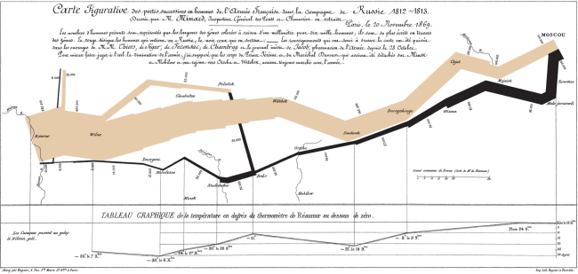
In the same book he showcases what he feels to be the best narrative graphic of space and time – Charles Joseph Minard representation of Napoleon’s ill-fated invasion of Russia in 1812. Six variable are plotted – the size of the army, it’s location on a two-dimensional surface, direction of the army’s movement, and temperatures on various dates during the retreat from Moscow. The comparative sizes of Napoleon’s invading army (in tan) to his meager retreating forces (in black) tell the story with eloquence.

Click images to enlarge
Minard Napoleon's Iinvasion