The Inconvenient Truth About Textbooks

School-books I just went to the iTunes App Store, and in one impulsive click, downloaded Al Gore’s companion app to his book “Our Choice: A Plan to Solve the Climate Crisis.”

It’s an immersive learning environment that begs the question – $4.99 iPad app or $49 textbook? 

Watch this promo video and you decide if the eBook has made the traditional textbook a relic. If you need some more numbers to help you make the decision -a quick search on textbook costs turned up this data from a 2005 report by the U.S. Government Accountability Office. “The average estimated cost of books and supplies for a first-time, full-time student at a four-year public institution was $898, or 26 percent of the cost of tuition and fees. At community colleges, the estimated cost of books and supplies was a whopping 72 percent of the cost of tuition and fees.” 

EBook or textbook – still trying to decide?  Don’t forget that future updates of the app could add more content or features – how about social networking?

Update: A hat tip to my friend Martin Edic at 24PageBooks who pointed out that Push Top Press (the folks who did the Gore’s book) plan to release a publishing platform for authors, publishers and artists to turn their books into interactive iPad or iPhone apps — no programming skills required. Imagine when students can make their own!

Student Personal Tech Devices in the Classroom? A Cartoon Parable

“The Cameraman” – From Cartoonist Chris Ware, animator John Kuramoto and Ira Glass of This American Life. First grade teacher, Jeff Potter tells Ira about an art project and the impact of  personal “technology” in the classroom. 

“The camera really changed the way we behaved…. We lost our humanity.”

Were the cameras really responsible for the student insensitively to the fight? Was banning the cameras the only alternative the teachers had? I don’t know. I wasn’t there. 

But it does strike me that the cameras were also a catalyst to creativity, collaboration, and powerful student engagement. Is this a parable about balancing the benefits and liabilities of cell phones and other student personal technology in the classroom?

Hat tip to David Kwasigroh

Historypin – Make DBQs with a Digital Time Machine That Layers Image, Story and Location

While planning for my next document based question (DBQ) workshop, I discovered Historypin. It’s a great mashup of digital photos with stories layered over Google maps. Users can search images by geography / time and post historic photos with stories to maps. It’s fascinating to view historic photographs set against the backdrop of current Google map street view.

Historypin

Here’s a circa 1894 photo I uploaded to Historypin showing a bridge crossing the Erie Canal in downtown Rochester NY. It’s layered over a functioning “street view” in Google maps.

In Historypin’s story section, I provide a brief history of the canal’s impact on the growth of the city.

Then I pose a question. “I wonder if the people in the old photograph still appreciated the canal’s role in creating the city of Rochester, or if they had come to see it as outmoded nuisance which divided the city in half?”

For more ideas for classroom see:  image guide | story guide | teachers’ notes

What I like most about Historypin is that it adds a new dimension to the DBQ approach to instruction – students don’t simply learn from historic documents – they get to document their world for future generations.

More from Historypin:

Historypin was created as part of our current campaign to get people from different generations spending more time together. From a lot testing, we found old photos are a great way of getting people talking about how their street used to look, what their grandparents were like and what’s changed (or not) over time. 

We decided to create a website where people everywhere could share their old photos and the stories behind them, pinning them to a map of the world. We also thought it would be neat if you could compare these old photos with how the world looks today, making the site a bit like a digital time machine. So we asked Google if they’d help. They let us use their map and Street View functionality and helped us build the site. 

The great thing about Historypin is that when they’re using the site, loads of people are spending time with someone from a different generation. Older people have attics full of old photos, younger people know when to click and when to double click.

Design Your Website from the Bottom Up

Design Your Website from the Bottom Up

Web-design

For months, I’ve noticed a steady stream of searches on this blog for “Design Your Website” or “Bottom Up.” I realized folks were looking for a PDF that I created back in 2000 as part of my web design class – we’re talking “old school” FrontPage webs! I started teaching web design to students and teachers back in 1997. Over 10+ years I helped hundreds of teachers and students get started.


I thought since people are still looking, I’d repost the PDF on my blog and save them some search time. Download Design Website From the Bottom Up 200KB pdf

Design tools have evolved greatly since then, but I think the “bottom up” approach still offers a useful perspective for thinking about information design. 

Reader smight also find some useful (but dated) resources at my site “Website Design for Teachers

How To Quantify Culture? Explore 500 Billion Published Words With Google’s Books Ngram Viewer

By now you must be aware that Google has been busy digitizing books – over 5 million are now available for free download and search. Recently Google Labs has made public a giant database of of names, words and phrases found in those books (along with the years they appeared). It consists of the 500 billion words contained in scanned books published between 1500 and 2008 in English, French, Spanish, German, Chinese and Russian. 

Google Labs has just posted the “Books Ngram Viewer” – a free online research tool that allows you to quickly analyze the frequency of names, words and phrases -and when they appeared in the digitized books. You type in words and / or phrases (separated by comma), set the date range, and click “Search lots of books” – instantly you get the results. Note: when “smoothing” is set to “0” the results will show raw data. Using a higher number produces an average – example “4” will give you four year running averages that will more readily display trends. 

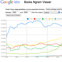
In this graph I searched “horse, carriage, canal, train, steamship, bicycle, car, airplane” and set the date range to 1800 – 2000.  Link to this transport graph at Books Ngram Viewer The results offer some insights into when these new transportation terms found their way into print. 

Transport-1

I think Books Ngram Viewer has many interesting applications in the classroom. The first that comes to mind, is as tool to introduce the research method – form hypothesis, gather and analyze data, revise hypothesis (as needed), draw conclusions, assess research methods. Working in teams students can easily pose research questions, run the data, revise and assess their research strategy. Students can quickly make and test predictions. They can then present and defend their conclusions to other classroom groups. All skills called for by the new Common Core standards.

Using the Ngram viewer, will enable students to discover many insights which will require revisions to their research strategies – a great way to explore word usage, social context and statistics. Words have multiple meanings. In my transport example “car” appears in the graph long before the advent of the automobile. Was it used as railroad car? In contrast to newspapers, events and trends take time to find their way into books. “Pearl Harbor” does not reach a peak until 1945.

The frequency of occurrence scale is important (vertical Y-axis.) If you graph a high frequency word against a low frequency word(s), the low is reduced to a flat line at the base of the scale. (Abraham Lincoln and Marilyn Monroe) Remove the high frequency (Abraham Lincoln) and re-run the graph – the low frequency (Marilyn Monroe) will appear with more detail. 

Need inspiration for nGrams? For a collection of clever searches Click here.

Updates: 

NGram Viewer has added a * wildcard feature. More on how to use it here Hat tip to Jean-Baptiste Michel of the nGram team who emailed me “In English, the data is good in 1800-2000, but not really before or after. Past that date, it looks like the composition of the corpus is changing; trends would indicate a shift in the corpus, not a shift in the underlying culture. So really, one shouldn’t look at data past 2000 in English.”

Analyze societal values: “ex wife, ex husband”  
 Changing laws and social values?
Watch the change in the Y-axis scale – add “my ex” to the original graph.

Ex-1

Track trends: “latte, sushi, taco”
Link to graph 
Are these new food fads?

Latte-1