America Divided: Teaching Media Literacy and Political Polarization

pew political polarization

The Pew Research Center has just released an update to its research series on political polarization in the American public. It provides engaging data visualizations and survey tools that are ideal for teachers and students of American government and politics. It’s also a great opportunity to explore news media literacy and critical thinking skills. 

For more ideas on teaching politics join #sschat on Twitter on Monday Nov 3 at 7 PM (Eastern) for “Election ’14: Teaching Politics, Controversy and Civic Engagement”

I will be guest hosting #sschat with my social studies methods students @EdMethods.

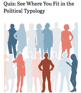
The Pew political polarization research is based on a national survey of over 10,000 U.S. adults conducted by the Pew Research Center. There is an online version of that survey Where Do You Fit in the Political Typology? Teachers can create a “community group” and have their students sign in when taking the survey. You will be sent a link to your quiz page, which you should use when sharing the quiz with your community or group. After at least five members of the group have taken your quiz, you will be able to view the aggregate results on the group results page, which compares your group’s overall results with the general public’s.

Next, I would recommend reviewing the interactive graphs that demonstrate political polarization between 1994 and 2014. The new survey finds that as ideological consistency has become more common, it has become increasingly aligned with partisanship. Looking at 10 political values questions tracked since 1994, more Democrats now give uniformly liberal responses, and more Republicans give uniformly conservative responses than at any point in the last 20 years

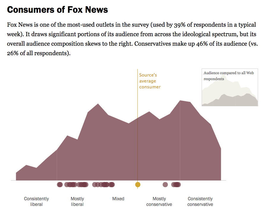
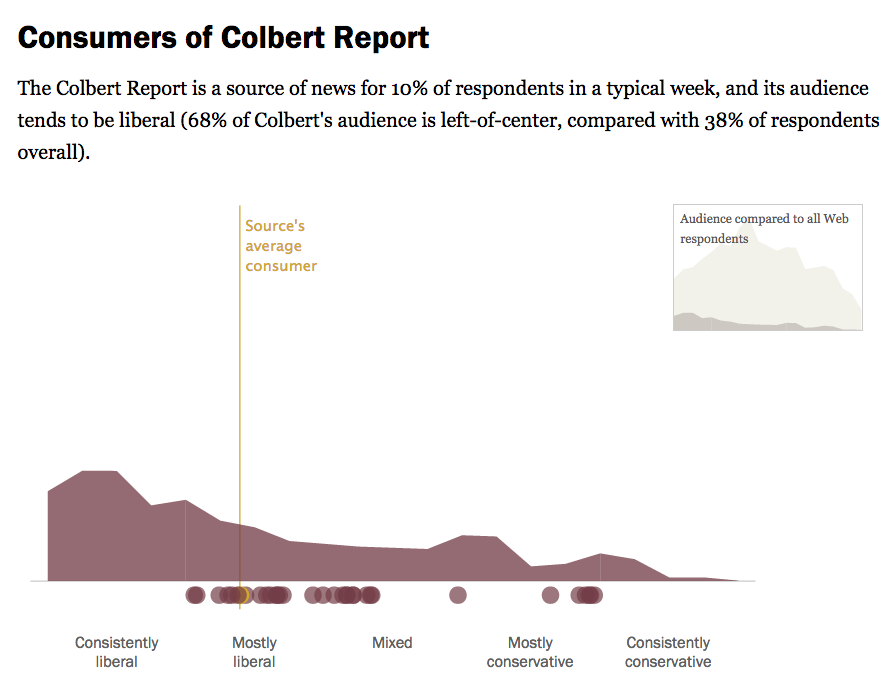
I would asks student to explore Political Polarization & Media Habits. When it comes to getting news about politics and government, liberals and conservatives inhabit different worlds. There is little overlap in the news sources they turn to and trust. And whether discussing politics online or with friends, they are more likely than others to interact with like-minded individuals, according to a new Pew Research Center study.

Students will enjoy exploring the sortable tables: Audience Profiles & Media Habits. There they can compare the audience profiles from diverse sources such as Wall Street Journal, Fox News, Colbert Report and the Glenn Beck Program.

Fox news

colbert report

Trust Levels of News Sources by Ideological Group

Quantify Culture with NGram Viewer and NY Times Chronicle

Frequency of "The Great War" and "WW"I in Books nGram Viewer Frequency of “The Great War” and “WW”I in NYT Chronicle

This week in my University of Portland EdMethods class we considered the impact of digital technology on teaching and learning. Innovation in instructional practice is coming from the “bottom up” – from teachers who find effective ways to harness the creative energy of their students. These teachers don’t simply deliver information to kids, they craft lessons where students can research, collaborate, and reflect on what they’re learning. They harness a flood of new platforms that enable students “see” information in new ways and support a more self-directed style of learning.

To demonstrate transformative web-based research tools, my EdMethods students spent time using Books NGram Viewer and NY Times Chronicle – to develop and test hypotheses. As part of an in-class demo of the power of word frequency research, they shared their results via a Twitter hashtag: #WordFreq. I’ve collected them in the Storify below

Books Ngram Viewer and NY Times Chronicle have many interesting applications in the classroom. For example, they can both be used to introduce the research method – form a hypothesis, gather and analyze data, revise hypothesis (as needed), draw conclusions, assess research methods. Working in teams students can easily pose research questions, run the data, revise and assess their research strategy. Students can quickly make and test predictions. They can then present and defend their conclusions to other classroom groups. All skills called for by the new Common Core standards. Ideas for classroom use Books Ngram Viewer and NY Times Chronicle. For more advanced searches using NGram Viewer click here.

Want more? You can explore word frequency in rap lyrics and NY Times wedding announcements.

5 Rules of Infographic Excellence

txkcd_infographic

xkcd’s brilliant mockery of the explosion of “info-junk” (at left) should remind us that the best infographics should efficiently combine quantitative data, prompt pattern recognition and cogent visual storytelling.

Perhaps aspiring infographic designers would do well to revisit the work of the Edward Tufte, the guru of the art form. I’ve had a chance to attend one of his inspiring workshops, but you easily appreciate his thinking from his books. In his classic “The Visual Display of Quantitative Information,” he lays out his principles of Graphical Excellence (p 51) Graphical excellence is:

  1. well-designed presentation of interaction data – a matter of substance, statistics and design.
  2. consists of complex ideas communicated with clarity, precision and efficiency.
  3. that which gives the viewer the greatest number of ideas in the shortest time with the least ink in the smallest space.
  4. always multivariate.
  5. requires telling the truth about data.

In the same book he showcases what he feels to be the best narrative graphic of space and time – Charles Joseph Minard representation of Napoleon’s ill-fated invasion of Russia in 1812. Six variable are plotted – the size of the army, it’s location on a two-dimensional surface, direction of the army’s movement, and temperatures on various dates during the retreat from Moscow. The comparative sizes of Napoleon’s invading army (in tan) to his meager retreating forces (in black) tell the story with eloquence.

Click images to enlarge
Minard Napoleon's Iinvasion

Have a Minute for the Shortest TED Talk Ever?

Who needs PowerPoint when you have a few stones for your infographic?
He even finds time to add a reflective question as a kicker. This talk ‘happened’ during a spontaneous interview with Hans Rosling, the famous TED speaker. Hans joined us at the TEDxSummit 2012 in Doha, April 15 — 20, Qatar for another memorable TED talk on global population predictions.

Infographic – Six Emerging Educational Technologies

The 2011 Horizon report identified six new technologies that will affect teaching and learning in the K-12 education community over the next five years.  

“Four to five years for Personal Learning Environments to have an impact?”  perhaps the Horizon report predictions on impact is already due for an update.?

Many innovative teachers are already harnessing these tools to to reframe the information landscape of the traditional classroom.

As I noted in Innovations in Teaching and Learning: Top Down or Bottom Up?

Head to the vendor area of an educational conference and you’ll see a “top-down” vision of innovation in schools – expensive stuff that delivers information – lots of flashy equipment like display systems, interactive whiteboards, etc. They might give the illusion of modern, but in fact they’re just a glitzy versions of the old standby – teaching as telling. Does anyone really think there’s an instructional ROI in jazzing up test prep with a “Jeopardy-style game” delivered by “cutting-edge display technology?”

In fact, the best innovation in instructional practice is coming from the “bottom up” – from teachers who find effective ways to harness the creative energy of their students. These teachers don’t simply deliver information to kids, they craft lessons where students can research, collaborate, and reflect on what they’re learning. They harness a flood of new platforms that enable students “see” information in new ways and support a more self-directed style of learning. Unlike the expensive wares being hawked by the convention vendors, most of these web tools are free.

In SmartPhone – Dumb School, I added

While I’ve seen some cutting edge schools / teachers that have effectively embraced mobile technology and social networking, too many educators see smartphones as a distraction from learning. Many schools block Facebook, Twitter and the rest of social web as if it was pornography.

So where’s this put our students? For many it means that they must leave their smartphone at the classroom door and surrender themselves to an information culture controlled by the adults. What’s the mobile context in schools? Not much, it’s banned as subversive to learning.

Every day in school, students must “forget” about the information control and functionally their phone gives them to browse, research, monitor, network, shop and entertain. While they might view a photo just posted to Facebook from a friend’s mobile as the catalyst to a conversation, their teacher considers it a distraction from learning.

…When students do get on a school workstation (laptop or desktop) they quickly realize that it doesn’t “know” them as well as their phone does. Their personal device carries a wealth of information that’s important to them – contacts, photos, data, memories. To the school desktop, students are just a user on the network with a limited range of permissions. The biggest problem with the school computer is that it doesn’t do “place” at all. That’s a stark contrast to students’ mobiles, which geo-browse via the growing number of locational apps and geo-tagged information stream.


Infographic credit: Saint Xavier University
Online Masters in Curriculum and Instruction